Shows sample images for the updater for widgets and quick
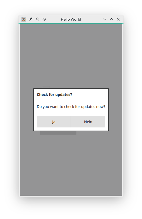
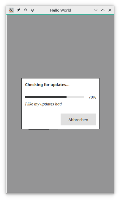
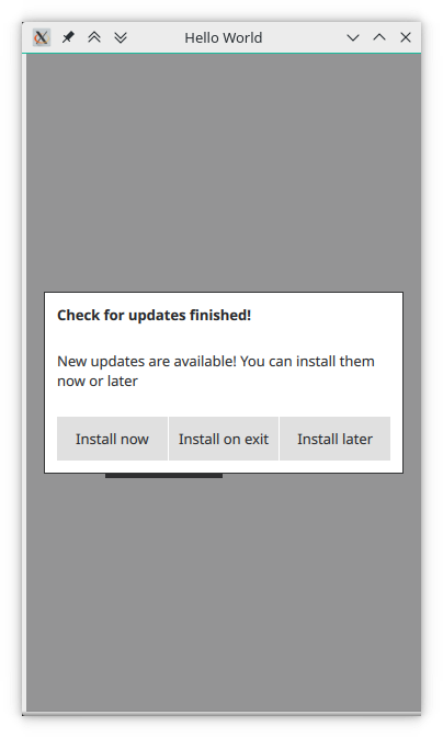
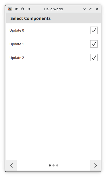
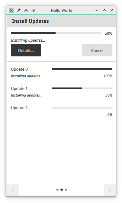
The following tables show the different parts of the GUI for both the widgets and the quick GUI. In both cases, the platform neutral styles have been chosen, i.e. Fusion for widgets and Default for Quick. However, all GUIs are designed in a way to adjust to any style. They will work with the windows, gtk and macOs widgets styles and with the Material, Universal and Imagine quick styles, as well as any other style.
If you want to find out how the GUIs look for your specific platform and style, try out the examples, as all of these images have been created with the examples.
| Element | Widgets | Quick |
|---|---|---|
| Ask Dialog | 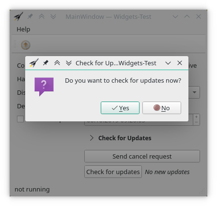
| 
|
| Progress Dialog | 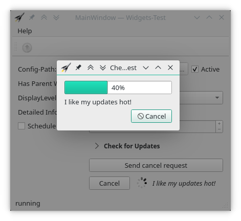
| 
|
| No Updates Dialog | 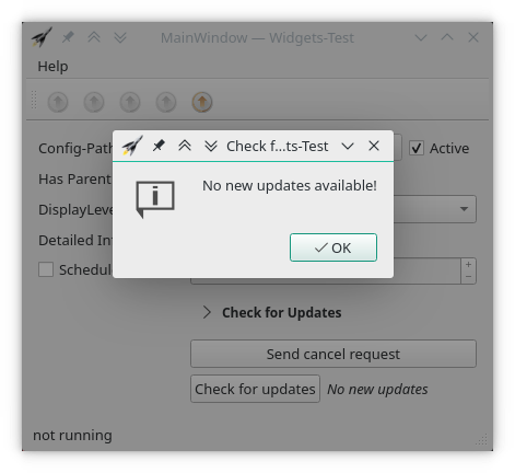
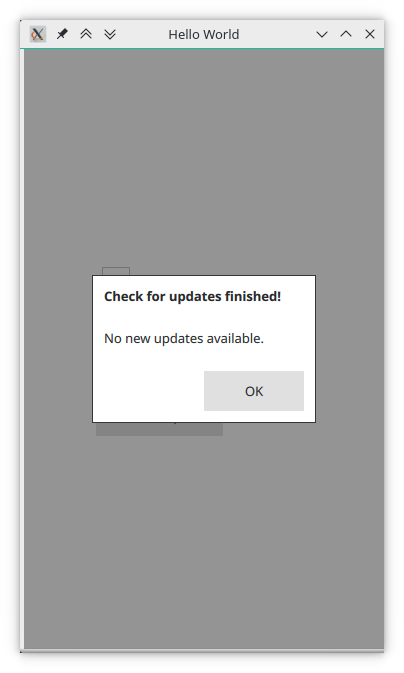
| 
|
| Detailed Update Information Dialog | 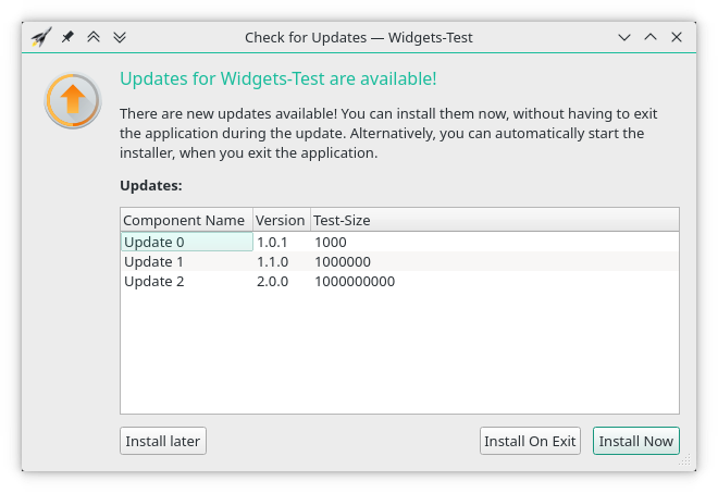
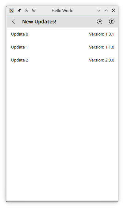
| 
|
| Simple Update Information Dialog | 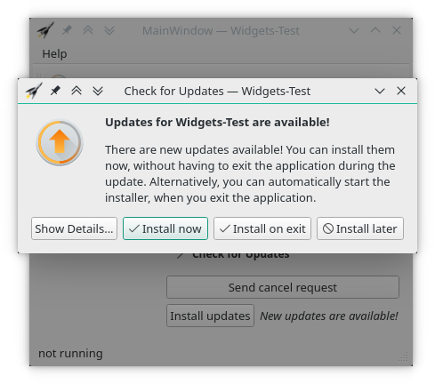
| 
|
| Element | Widgets | Quick |
|---|---|---|
| Component selection page | 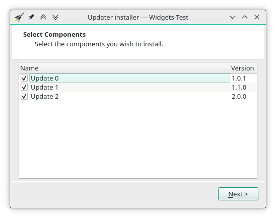
| 
|
| Installation progress page | 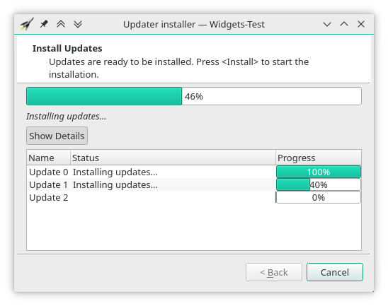
| 
|
| Element | Widgets | Quick |
|---|---|---|
| Default Button state | 
| 
|
| Checking Button state | 
| 
|
| New Updates Button state | 
| 
|
| Update action | 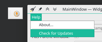
| 
|
 1.8.16